Next part of the MPS toolkit: The Demand – Supply – Inventory graph
We are very eager to take you to the next part of the Master Production Schedule toolkit: the graph that shows the demand, supply and inventory.
Before we start, let’s recap
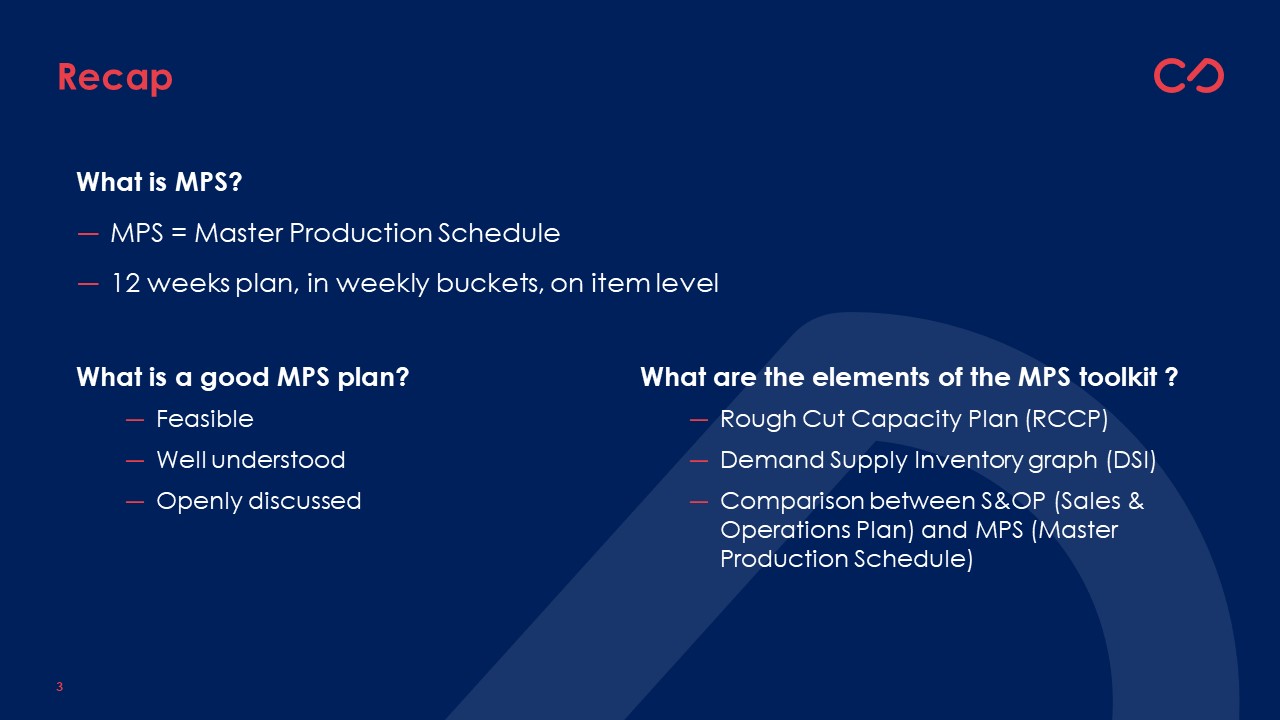
In one of the last blogs, we indicated that the Master Production Schedule is the item-level plan in the upcoming MPS horizon, typically divided in weekly buckets and covering a 12-week horizon.
We also highlighted what we believe characterizes a ‘good master production schedule’. We mentioned it needs to be:
- Feasible
- Well-understood
- Openly discussed
If you want to know more about the above statements, don’t hesitate to refer to the previous blogs. You can find them all on our website www.allics.be.
Introduction to the toolkit
Today, we want to further discuss how to come to a better understanding of the Master Production Schedule! We will introduce you to one of the elements of the MPS toolkit!
The MPS toolkit consists basically of three elements:
- The Rough Cut Capacity Plan
- The DSI graph (Demand-Supply-Inventory)
- The Comparison of the MPS versus the S&OP
Next to that, there are various KPI’s that you want to measure to support the understanding. We don’t want to completely overwhelm you with all this information in one single blog. So, we decided to focus this blog purely on one element of the toolkit. We will keep the KPI’s, processes, meeting setups for one of our upcoming blogs.
The DSI graph
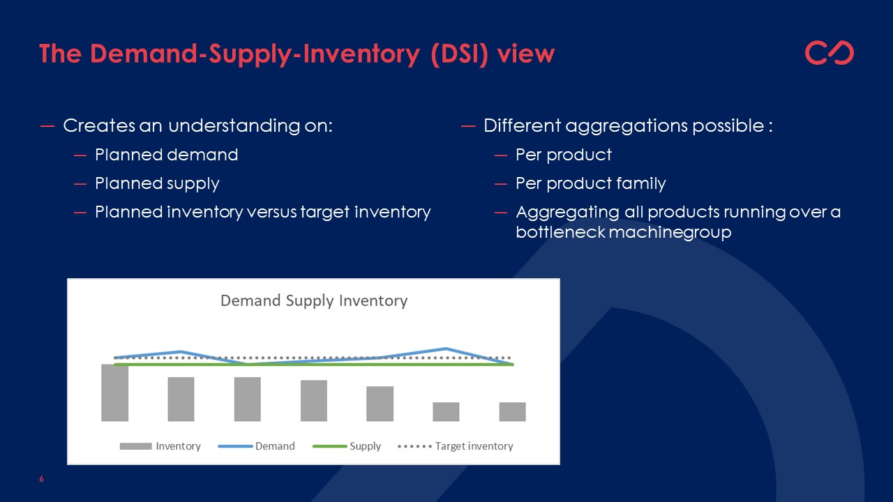
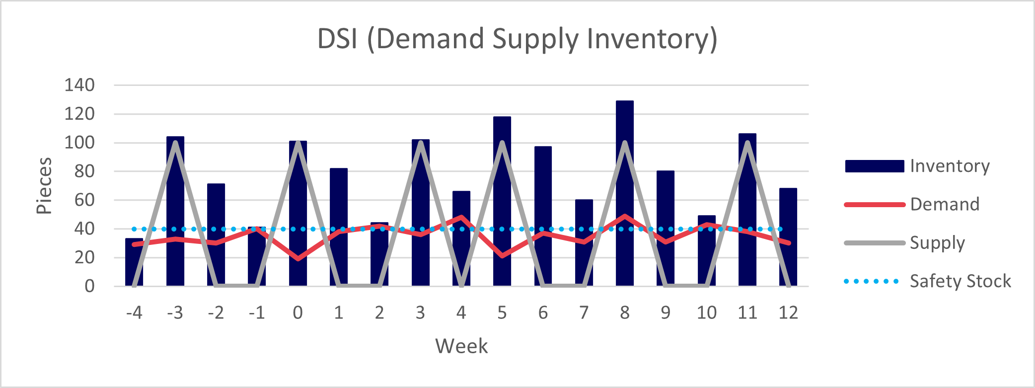
The DSI graph is a fairly easy graph. It shows in one graph the expected demand, supply and inventory, typically per week for a group of items. To better understand how the future relates to the past, it can be useful (if possible) to also include the information on the past demand, supply and inventory data for the same group of items.
Why do you need a DSI graph?
Understand the demand supply and inventory plan of your portfolio
We need it to understand our plan: which assumptions do we take on the expected demand, what are we planning to supply and what does that mean in terms of inventory.
Each planner should have at least a DSI graph of his own portfolio. It gives him or her the insights on how the DSI is looking like for the planner’s area of responsibility.
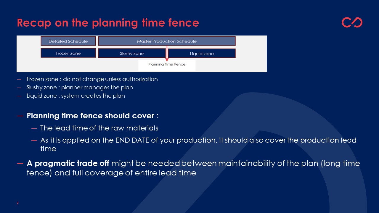
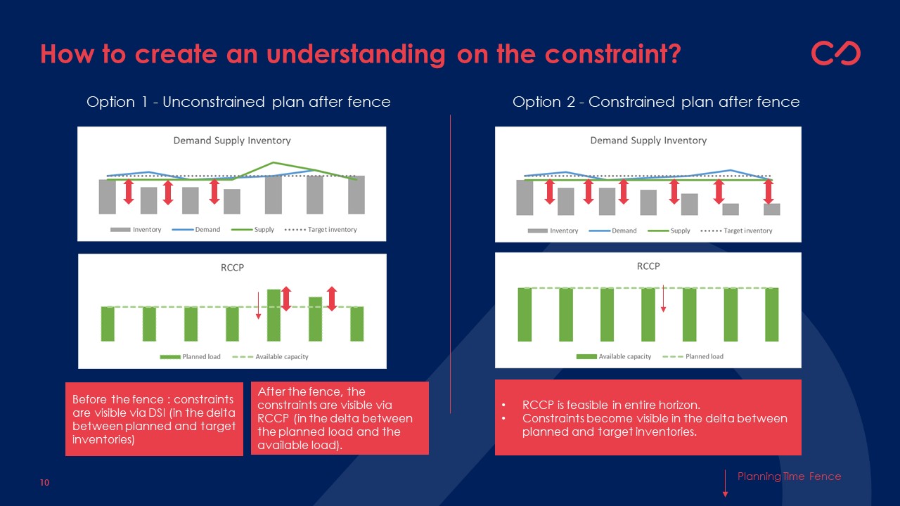
- Within the planning time fence, the DSI will give the results of the constraints the planner took into account on the projected inventory.
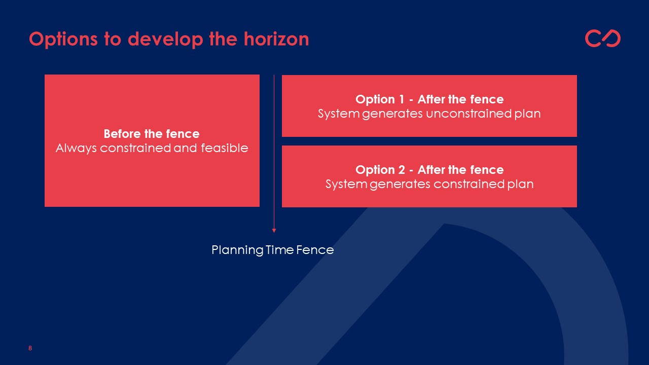
- After the planning time fence, there are two options:
- Either the system is generating an unconstrained plan. In that case, you might see an ‘unrealistic supply’ after the fence that will generate an issue on the RCCP part. So, the planner will need to focus on understanding the DSI within the fence and the RCCP within and after the fence.
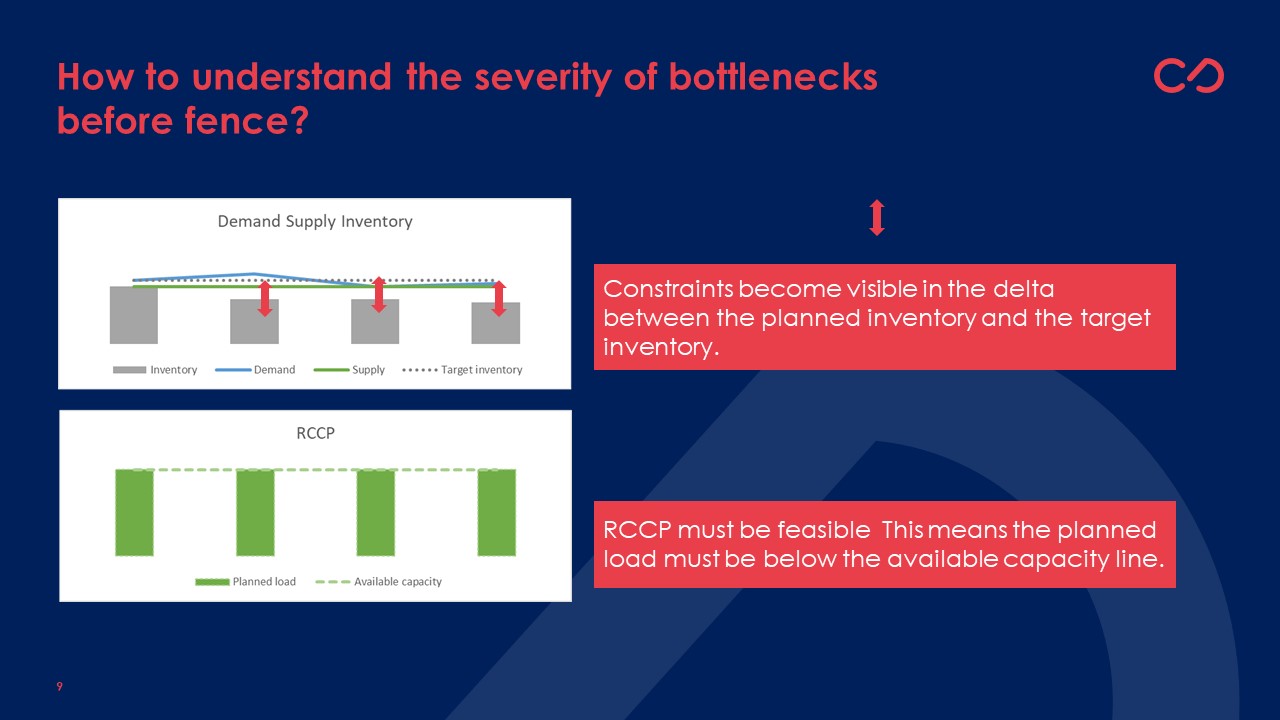
- Or the system generates a constrained plan. In this case, the RCCP will always show a feasible plan, and the constraints will become visible on the DSI graph showing potential under- or out-of-stocks.
Understand whether the current planned inventories are in line with the S&OP inventory plan
Next to understanding the evolution of inventories and how supply and demand relate to each other, the DSI graph can also help the planner to understand to what extent the S&OP inventory plans are in line with the MPS plan. If the scope of the products and the scope of the region is the same, the planner can clearly see whether there is a deviation. It might reveal a need to further analyze the causes of this deviation (demand deviations / supply deviations / data errors?).
Understand the impact of certain constraints on the planned inventories
In case you face a constraint, it is useful to aggregate your DSI chart on the level of this constraint. It will support your understanding of the impact of that constraint on the planned inventories.
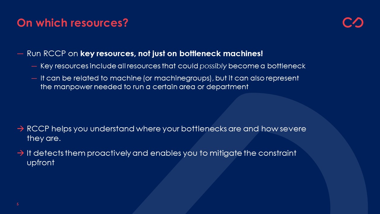
For instance, if equipment group A is constrained, your RCCP should remain feasible, at least within the fence. However, there is a need to understand what this constraint will mean towards the planned inventories. Therefore, it is useful to aggregate the DSI not only on product level, but also on the selection of products impacted by this certain constraint.
In a similar way, the planner might see a need to understand the DSI of all products being delivered to a certain customer group.
To conclude: To create the needed understanding, the DSI is needed but not sufficient
The DSI is a very helpful tool and has its key-position in the MPS toolkit. However, the DSI alone will not give you full understanding. Within the fence, it will always give you a realistic view on your planned inventories, supply and demand (given the planner is managing a feasible plan). After the fence, the DSI will:
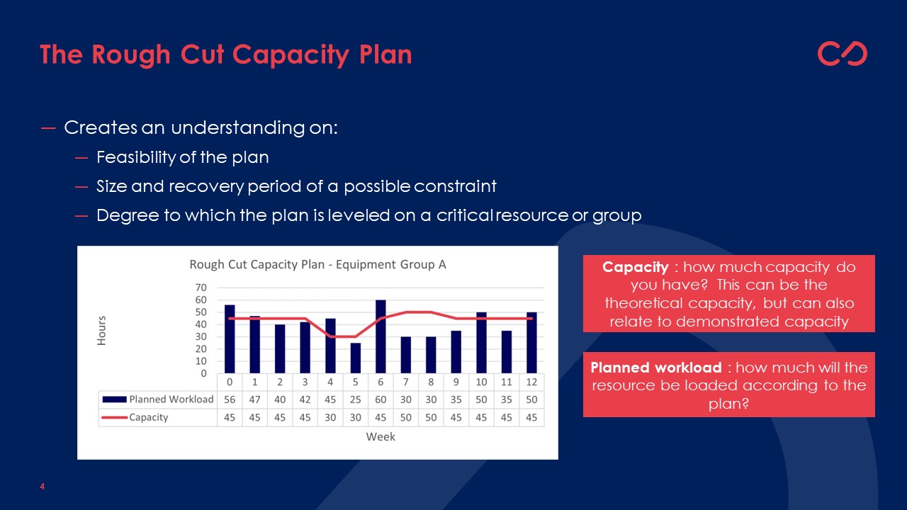
- Either show a plan that moves towards the tactical inventory settings in the system, replenishing the products in an unconstrained way. In this case, the RCCP will show the size of the constraints. In the last blog, we indicated you might want to visualize your RCCP in a cumulative way to understand the duration of the constraint.
- Or show a plan that is always realistic versus a constrained plan. In that case, the RCCP will always show a feasible plan, also after the fence. If the plan is constrained, the DSI will show you the impact on the planned inventories.
Next to this marriage between the DSI and RCCP, we also need to talk about the decision boundaries of the planner, and how it links with the S&OP planning level. For this, in the next blog, we need to introduce the “Comparison of MPS vs. S&OP”, assuring we understand and govern the possible deviations between the MPS and the S&OP!


